bloc zero
No added code or class - just a bloc and two brics with color background.
bloc one
Section 1 before
background:url
used Bear Grylls graphics from: https://www.creativebloq.com/how-to/create-a-layered-parallax-effect-on-your-site
as you scroll, different blocs will pass behind different layers based on @PEALCO code and custom class
resized Bear Grylls images to 1140x760
Viewed on a 10.5” iPad, Safari Responsive Design Mode, or resized window (1112x834), this create a cool effect.
bloc two
No added code or class
Img bric below with “ADVENTURE” graphic

bloc three
section 3 before
background:url
bloc four
No added code or class - just a bloc and two brics with color background.
bloc five
no added code or class
bloc six
No added code or class
bloc seven
No added code or class
background color in blocs
bloc eight
No added code or class
bloc nine
Section 7 before
background:url
Also added background color in blocs
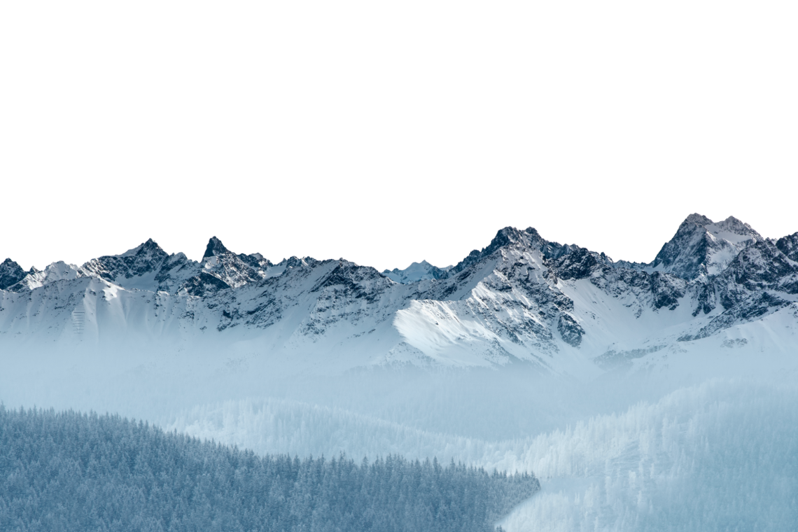
The bg image for this added code is the small mountains in the foreground
the bg color in blocs passes behind the code bg img and the text from blocs passes in front
Comapre to bloc 11 where everything passes in front
bloc ten
No added code or class
bloc eleven
No added code or class
bloc twelve
No added code or class
notes bloc - no added code or class, background color in bloc
below are my notes from messing with code and my desired page structure
Navbar directory:
PARALLAX is mock-up of the site I am trying to build with 12-bloc structure mentioned below
BEAR-GRYLLS is a multi-layer parallax effect using @PEALCO’s code and graphics from creativebloq.com link below
MULTI-LAYER is a step up from @PEALCO’s code where I modified parameters to better visualize the code
BASIC is a page with the exact instructions from @PEALCO in the forum post linked above
NOTES is this section of the BEAR-GRYLLS page.
see this forum post for code example used on some of these example pages:
https://forum.blocsapp.com/t/parallax-effect-working-on-ios-ipad-and-iphone/2442/21
My desired page structure starts with parallax hero bloc, then a static bloc, continues to alternates parallax & static blocs
NO global header (sticky header from hero in bloc1)
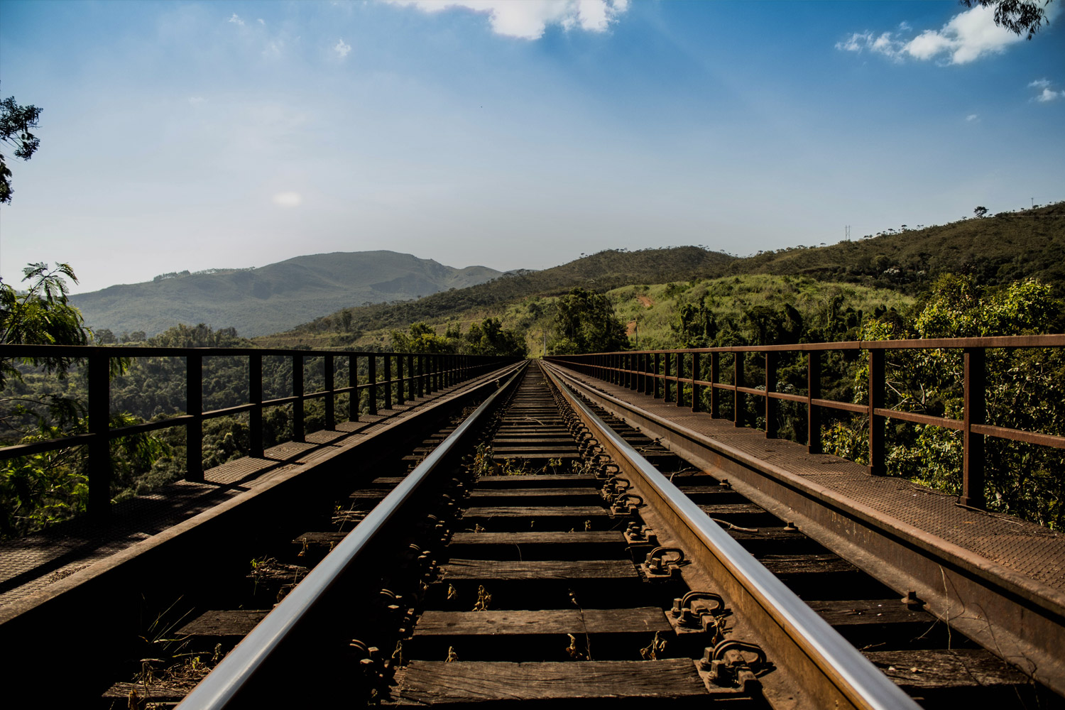
bloc1-hero - (12.jpeg) parallax background, gradient overlay (sticky nav bar)
bloc2-intro - static, purple color background
bloc3-about - (12.jpeg) parallax background, gradient overlay
bloc4-coach - static, no background img or color
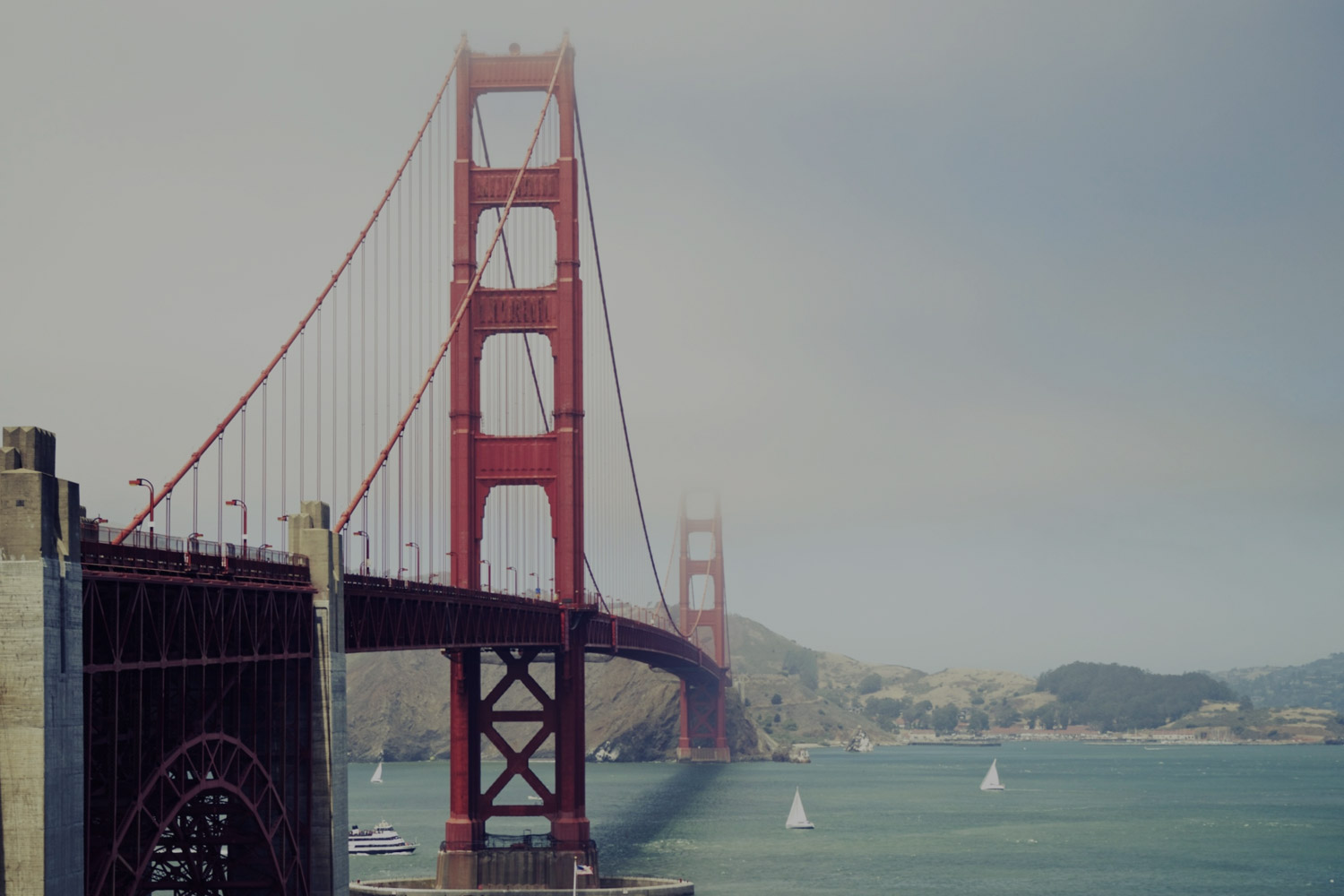
bloc5-services-hero - (camera.jpeg) pararlax background, gradient overlay
bloc6-services - static, no background img or color
bloc7-tales - (7.jpeg) párallax background with overlays
bloc8-pricing - static, no background img or color
bloc9-contact-hero - (3.jpeg) parallax background, gradient overlay
bloc10-contact-form - static, no background img or color
bloc11-newsletter - (14.jpeg) parallax background, overlays
Bloc-placeholder - referenced coded parallax images, hide visibility
bloc12-footer (global footer) - static, no background img or color
NOTES FROM EXAMINING and MESSING AROUND WITH THE CODE from @PEALCO:
There is a lot going on with these pages and all the layers, but it helped me visualize the code from @PEALCO
code uses CSS to create parallax effect via fixed background image “before" a bloc with a custom class
code for non-parallax sections (ex: .section-two; position:relative; background:blue;) isn’t really needed
Using a fixed background is not the same a a true parallax effect, but is similar to the implementation native in blocs
A fixed background image from later blocs (ex: 5 or 7) will just overlap fixed backgrounds from previous blocs
To get my desired look, bg imgs need to be “dynamic" based on what bloc is in the foreground as you scroll
In this code implementation, the bg img is full size and takes up as much screen as allowed
The ht and width parameter changes to this code render img to be effectively “cropped" vs resized
A hero bloc can disrupt the code in some implementations due to fullscreen padding
You can see how text from blocs/brics moves in front and behind the different images based on their “section” class
The bg img layers “break” link/interaction in the content areas because the bg img is layered over-the-top
Example, part 1: you can’t click the “Get Started” button in bloc 1 (it is “behind" transparent parts of bg imgs)
Example, part 2: you can click the links in this bloc because they come “after” all the bg img code sections
In MULTI-LAYER page, I used diferrent top/left offsets and height/width to easily see the different layers
Global header (set as not sticky) and “bloc-zero” are behind the first fixed bg img associated w/ bloc1-section1
I did try adding the “section-one” code and class to a copy of the desired page on a Trial Page:
The img used as a fixed background would need to be scaled for size as in Bear Grylls, but lose responsive
The gradient effect used at the bottom of the first bloc was behind the background insted of in front like the other brics
The gradient is created with a custom class, this could be why it is behind vs. in front of the background
Precedence of the “section-one” class for the special page code over the custom class in blocs?
The fixed background image is visible behind later blocks that do not have a background
I’v been doing lots of GTS reasearch on finding a solution for parallax on mobile (iOS):
https://forum.blocsapp.com/t/any-idea-how-to-replicate-this-parallax-fx/5981
https://www.w3schools.com/css/css3_3dtransforms.asp
https://www.w3schools.com/howto/howto_css_parallax.asp
https://medium.com/@dhg/parallax-done-right-82ced812e61c
https://www.creativebloq.com/how-to/create-a-layered-parallax-effect-on-your-site - BEAR GRYLLS GRAPHIC
https://css-tricks.com/ios-13-broke-the-classic-pure-css-parallax-technique/ -Creator of CodePen
https://developers.google.com/web/updates/2016/12/performant-parallaxing
https://siteorigin.com/fixed-vs-parallax-background-images/
https://community.adobe.com/t5/dreamweaver/simple-but-specific-parallax-scrolling-question/td-p/10226896?page=1
https://www.cssscript.com/smooth-parallax-scroll-plugin-universal-parallax/ - Javascript/CSS plugin for true parallax
https://www.jqueryscript.net/blog/best-parallax-scrolling.html
https://www.cssscript.com/top-10-javascript-css-parallax-scroll-effects/
The links in ORANGE are the ones I found most interesting.
I used the Bear Grylls graphics and @PEALCO’s code to make an example page.
The example with Bear Grylls graphics is a cool effect, but had to downscale the images to fit the XL breakpoint
Even with the downscaling, the bg imgs are not responsive and imgs are cut off at small breakpoints
Full "add code" used for this page:
NOTE: Custom classes set for section 1,3,5,7 only. Section 2 and 4 classes not used on this page.
<style>
.section-one {
position:relative;
}
.section-one:before {
content:'';
background:url('./img/bgcrop2.png') no-repeat;
position: fixed;
top:80px;
left:0px;
height:100%;
width:100%;
}
.section-two {
position:relative;
background:blue;
}
.section-three {
position:relative;
}
.section-three:before {
content:'';
background:url('./img/textcrop2.png') no-repeat;
position: fixed;
top:-80px;
left:0px;
height:100%;
width:100%;
}
.section-four {
position:relative;
background:purple;
}
.section-five {
position:relative;
}
.section-five:before {
content:'';
background:url('./img/mtn1crop2.png') no-repeat;
position: fixed;
top:80px;
left:0px;
height:100%;
width:100%;
}
.section-seven {
position:relative;
}
.section-seven:before {
content:'';
background:url('./img/mtn2crop2.png') no-repeat;
position: fixed;
top:80px;
left:0px;
height:100%;
width:100%;
}
</style>
placeholder bloc for code images


set screen to 1140x834 for best result & scroll to see the magic!